Find where a component is used
Every component has a page that shows where it is used: across every repo, and inside one repo down to the file and line. For example, open Button from @acme/ui to see that storefront and checkout both use it and which version each is on, then which files in storefront still set variant="secondary".
This page assumes the dashboard already has scans uploaded. If it has none, start with Explore the dashboard.
Open a component across repos
- Select packages in the top navigation.
- Type
@acme/uiinto the search box and open the package's row. - In the package page's Components table, search for
Buttonand select its name.
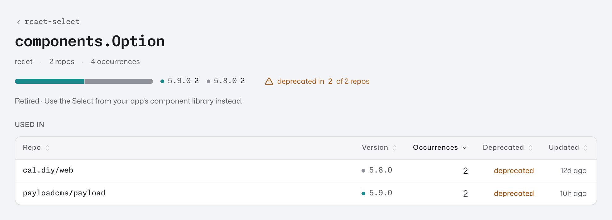
The header gives the framework, how many repos use the component and its total occurrences. If the component is deprecated, the header says so, for example deprecated in 5 of 5 repos, with a line naming its successor or reading Retired.
The version bar splits the component's occurrences by version, summed across repos. The highest version is teal and every lower one is grey. "Highest" means the highest version found in these scans, not the newest one published.
The Used in table has one row per repo whose latest scan includes the component, heaviest users first:
- Version: a teal dot marks repos on the highest version, so a grey dot is a repo that is behind.
- Deprecated: whether a lifecycle record covers the component.
- Updated: the date of the commit that repo's numbers come from.
Select a row to open the component's page for that repo.
A component defined in the repo, with no package, is not listed under any package. Open it from the repo instead.
Open a component in one repo
- Select repos in the top navigation and open the repo.
- On the Components tab, search for
Buttonand select its row. See Find components in a repo for the filters.
Badges beside the name show its origin (external or local), its framework (React, Vue, Web component or Tag), and deprecated when a lifecycle record covers it. The line below gives its package, or <no package>, the entry point when it was imported from a subpath (button for @acme/ui/button), the installed version, and, for a component defined in the repo, the file and line where it is defined.
The page always shows the repo's latest scan, even when the repo page is showing an older scan.
It has two tabs: Usage (the default) and Composition. The tab you pick, and the search, filters and sort on Usage, are kept in the page URL, so a copied link opens the same view.
See how it is used
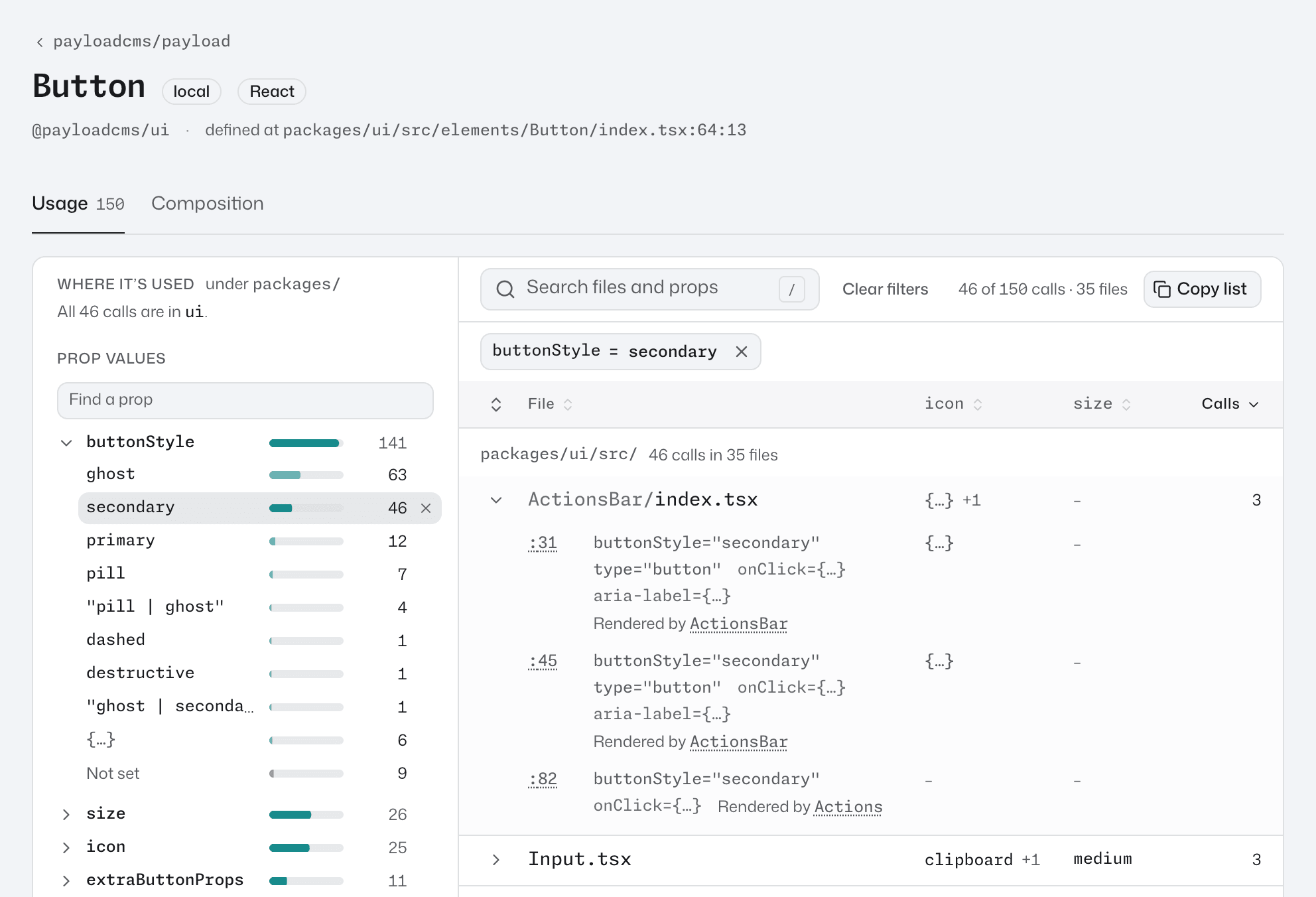
The Usage tab has a column of filters beside the list of files that call the component. On a narrow window the filters fold away above the list: press Filter, or Where it’s used and prop values, to show them.
Filter by folder
Where it’s used lists the folders the calls are in, with how many calls each holds. When every call sits under one folder, the heading says so, as in under src/, and the list starts one level below it.
Press a folder to keep only its calls, and press it again to remove the filter. For a deprecated component the heading reads Where it’s still used.
Filter by prop value
Prop values lists each prop the calls set, most set first, with how many calls set it. Press a prop to open its values, each with how many calls set it:
primary: a value written in the code, as invariant="primary".{…}: a variable or an expression, as invariant={tone}orlabel={t("save")}.- Not set: the calls that don't set the prop.
Press a value to keep only its calls, and press it again to remove the filter. Pick two values of one prop, such as primary and secondary, to keep the calls that set either. Filters on two props, or on a prop and a folder, keep only the calls that match both.
A prop that no call in view sets is folded into a Not set group at the end of Prop values. Undeclared after a prop's name means the component's declaration doesn't list it. When the component has many props, type part of a name into Find a prop to narrow the list.
Three more groups below Prop values filter the same way. Press a group's heading to open it:
- Styling:
className,class,style,sxandcss. - Events: handlers such as
onClickin React, and listeners such asclickfor a Vue@click. - Attributes:
data-andaria-attributes,key,ref, test ids such astestId, and some HTML attributes. When the scan knows the component's props, HTML attributes such asid,roleandtitleare listed here unless the component declares them. When it doesn't know them, onlyid,roleandtabIndex(tabindexin Vue) are, and other HTML attributes such astitlestay under Prop values.
Search and remove filters
Type into Search files and props to keep the calls whose file path or props hold the text, such as checkout/ or size=large. A component with only a few calls has no search box.
Each filter shows as a pill above the list, such as variant = secondary. Press a pill's × to remove it, or Clear filters to remove them all and keep the search. The count at the top of the list says how many calls are in view, as in 12 of 40 calls · 5 files.
Read the file list
The list has one row per file, the file with most calls first. Each row shows the file's name. A parent folder shows before it, faint, only when two files share a name or the name says little on its own, such as index.tsx.
A long list that spans several folders is grouped under a heading for each folder, the folder with most calls first. Sorting by another column, or filtering by a folder, shows one list again.
Press a file's row to open it. It lists one line per call, in line order, with the props written there, such as :42 variant="secondary" size="sm". A call can also show:
- Rendered by and the component whose code renders the call, or each one when several do. Select a name to draw its path on Composition.
- Imported as and the name the file gives the component, as in
import { Button as ShopButton } from "@acme/ui". - via and a name, when the code doesn't render the component by its own name: the function it's passed to, as
makeControlinmakeControl(Input), or a wrapper such asmemo. The artifact reference describes each.
Select a line number such as :42 to open that line in the repo's git host, at the commit that was scanned. A file's name opens the file at its first call. When the scan recorded no git remote, or one the dashboard can't read, both are plain text.
On a wider window, the props most calls set get a column each, showing each file's most used value, and a count such as +2 when the file's calls differ. Press a column heading (File, Calls or a prop's name) to sort by it, and press it again to reverse the order.
Copy the list
Copy list copies the calls in view as text: the component and repo, the filters, each file with its line numbers and a link to its first call, and a link back to this view. When a long list is grouped by folder, each folder's heading has its own Copy.
Composition
Composition shows what renders this component and what it renders, anywhere in the repo, as two lists and a render tree. Press a row in a list to draw its path on the tree. Composition and ownership explains how this is worked out.
A Rendered by link on Usage opens Composition with that component's path drawn. Your browser's Back button then returns to Usage with the same search, filters and sort, the same files and props open, and the list scrolled to where you left it.
Good to know
{…}is not missing data. It's a variable or an expression, whose value is worked out when the app runs, so the scan can't know it. Event handlers such asonClick={save}always read{…}under Events. On a call's line, a variable keeps its name, as invariant={tone}, and a spread such as{...props}reads{...rest}.- One call can count more than once. A tag inside a helper function, such as a
renderRow()that returns JSX, counts once for every component that calls the helper. It shows as one line, with each of those components after Rendered by. - The import path is part of the component.
Buttonfrom@acme/uiandButtonfrom@acme/ui/buttonare two components, each with its own page. A lifecycle record onButtoncovers both.
Reading the numbers explains what each count includes.
Next step
Found repos still using a component you want to replace? Track a migration follows each repo's progress to its successor.