Explore the dashboard
In this tutorial we'll upload a scan to the dashboard and walk through it. We'll find our repo, read what it uses, and follow one component down to the line that uses it. Then we'll tag our design-system libraries and record that an old button is being replaced by a new one. By the end we'll have a migration chart that updates every time a new scan is uploaded.
Before we start
- The repo from Scan your first repo, with its dependencies and the CLI installed and its
scout.config.jsonin place. - That repo checked out on its default branch, up to date with a remote we can push to, and with no uncommitted changes besides what the first tutorial added.
- A running dashboard that we can sign in to. Run the dashboard locally sets one up at
http://localhost:3000and signs us in to it in the browser. - A browser window at least 1024 pixels wide, such as a laptop screen at full width. On a narrower window, the component page in step 4 folds its filters away above the list of files.
We'll keep following the storefront example from that tutorial. Its scan found:
Buttonfrom@acme/ui, used twice, andCardfrom@acme/ui, used once.LegacyButtonfrom@acme/ui-legacy, used once. This is the old button we want to get rid of.- Three components the repo defines itself:
ProductCard, used once, andAppandCheckout, which nothing uses.
Our own repo will show its own components and numbers. Wherever the steps open Button or LegacyButton, we open a component our repo uses instead.
Step 1: Upload our scan
To upload, the CLI first signs in to the dashboard. In the root of our repo we run:
npx scout auth login --host http://localhost:3000
We write the full address, including http://. For a dashboard our team already runs, we use its address instead. The CLI prints a link and a code, and opens our browser at the link:
To authorize this device, open:
  http://localhost:3000/login/device
Code: HJKM-4TQX
Opened your browser…
Our code will be different. If the browser doesn't open, we open the link ourselves with our code on the end, such as http://localhost:3000/login/device?code=HJKM-4TQX. The browser shows an approval page with our email under Signed in as and the same code under Device code. We check that the code matches and press Approve. The terminal finishes with:
✓ Signed in as dev@acme.test
Now we scan and upload. scan takes only a commit that's on the remote's default branch, with the repo's dependencies installed and no uncommitted changes apart from the config and the scan file. In the first tutorial we added the CLI to package.json, so we commit that and push it.
Then we install with npm ci, which leaves package-lock.json as it is. With Yarn, we'd commit yarn.lock instead and install with yarn install --immutable. We name the host again, so the scan goes to this dashboard even if the CLI is signed in to another one (Name the host you upload to explains why):
git add package.json package-lock.json
git commit -m "Add the Scout CLI"
git push
npm ci
npx scout scan --host http://localhost:3000
It prints the same scan summary as before, then says it's waiting while the dashboard processes the scan. The last line gives the address of our repo's page:
Waiting for the dashboard to process the scan…
Uploaded scan 01M39ZTTR7833Q5PMDSCJNKN5S → http://localhost:3000/repos/acme%2Fstorefront
Step 2: Find our repo
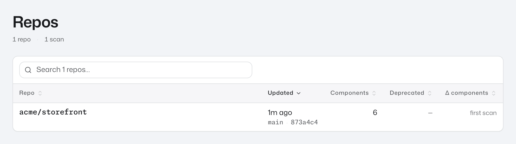
We open the dashboard. It starts on the repos list, which reads 1 repo · 1 scan and has one row, acme/storefront. That is our repo id, from our config.
The row shows the date of the commit we scanned, with its branch and commit. Components reads 6, every component the scan found, including App and Checkout. Δ components reads first scan, because there is no earlier scan to compare with yet.
Step 3: Read the repo page
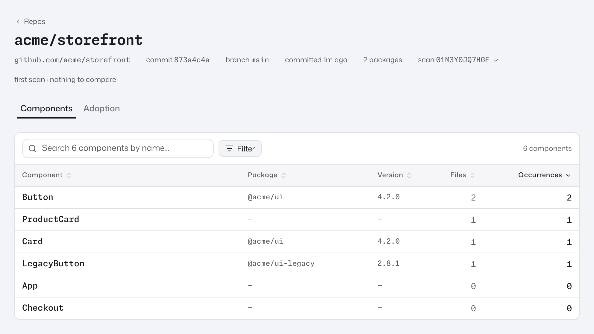
We click the acme/storefront row. The repo page opens on its Components tab. Near the top, the status line reads first scan · nothing to compare. After the next scan, it will say what changed since this one.
The table has one row per component, sorted by Occurrences, highest first. An occurrence is one place in the code where a component is used. We see:
Buttonfirst, with Package@acme/ui, Version4.2.0and Occurrences2.Card, from@acme/ui, andLegacyButton, from@acme/ui-legacy, with1each.ProductCardwith1, andAppandCheckoutwith0. These show—under Package, because they are defined in the repo.
We click the Adoption tab. It reads No migrations or retirements tracked yet., with an Open Governance link. We'll give it a migration in step 6. Repos describes the rest of this page.
Step 4: Open a component and its calls
We go back to the Components tab and click the Button row. The component page opens on its Usage tab, with 2 beside the tab's name. These are Button's two occurrences, which this tab lists as calls.
The tab has a column of filters on the left and the list of files on the right:
- Where it’s used has under
src/beside it, and lists two folders,componentsandsrc/, with1call each. - Prop values lists
variant, set on both calls. - The list has a row for each file,
src/App.tsxandProductCard.tsx, and the count above it reads2 calls · 2 files.
Button has only two calls, so both files are already open, with one line per call. src/App.tsx shows Rendered by App and :8 variant="secondary". ProductCard.tsx shows Rendered by ProductCard and :7 variant="primary". Rendered by names the component whose code renders the call.
We press variant under Prop values to open its values: primary and secondary, each with 1. We press primary. A pill reading variant = primary appears above the list, the count changes to 1 of 2 calls · 1 file, and only ProductCard.tsx is left.
We select :7, which opens line 7 of ProductCard.tsx on GitHub, at the commit we scanned.
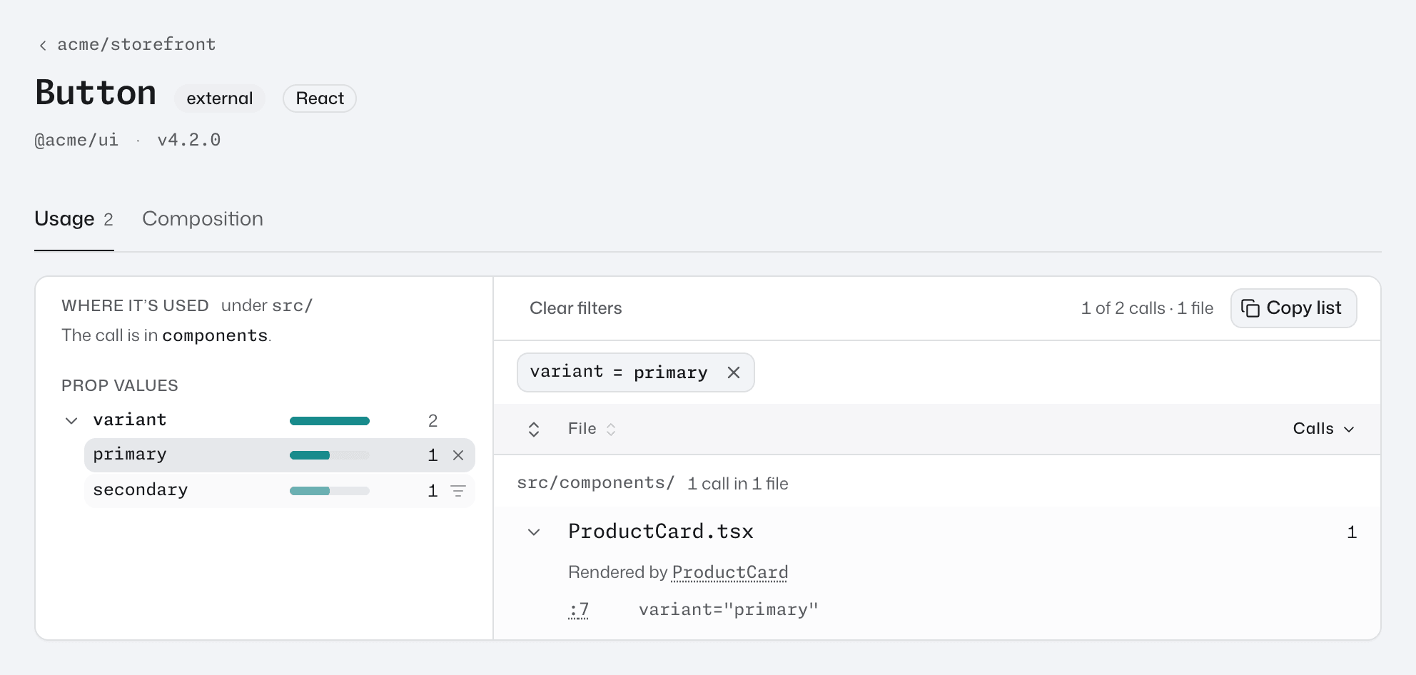
We press the × on the pill to remove the filter, and both files are back. A component with more calls also has a search box above the list. Find where a component is used covers the rest of the tab, including search, sorting and Copy list.
Step 5: Tag our libraries
A tag groups packages under one name, so the dashboard can count a library as one thing. We'll make two: acme-ui for the current library and acme-ui-legacy for the old one.
We select governance in the top navigation. A New lifecycle record form is already open at the top; we'll use it in step 6. For now we scroll down to the Tags section.
- We press New tag.
- We type
acme-uiinto the value (e.g. core) box and keep the colour it offers. - Under Exact names, we enter
@acme/ui. - We press Create.
The tag list shows acme-ui with 1 rule. We repeat the steps for acme-ui-legacy, with the exact name @acme/ui-legacy.
We use exact names so each tag matches one package. A glob pattern such as @acme/ui* would match @acme/ui-legacy too, and the old library would count in both tags. Tags covers glob patterns.
To see the tags at work, we select packages in the top navigation. @acme/ui now has an acme-ui chip beside its name, and @acme/ui-legacy has an acme-ui-legacy chip. From here on we can filter by library and compare the two libraries in a chart.
Step 6: Record a migration
We want everyone to move from LegacyButton to Button. A lifecycle record tells the dashboard that. The dashboard then marks LegacyButton deprecated in every repo, including scans already uploaded.
We select governance again. In the New lifecycle record form:
- We click Source, type
legacy button, and pick theLegacyButtonrow under@acme/ui-legacy. - We leave Disposition on Superseded.
- We click Superseded by, type
button, and pick theButtonrow under@acme/ui. - We press Create.
The record's row shows @acme/ui-legacy / LegacyButton with superseded → @acme/ui/Button. Its status is worked out in the background, so we reload the page. The line under the Governance title now reads 1 active · 0 complete, and the row reads active, because acme/storefront still uses LegacyButton. If the row has no status yet, we wait a moment and reload again.
We select repos and open acme/storefront:
- The status line now starts with
1 deprecated component in use. - In the Components table,
LegacyButtonhas a warning icon after its name. - On the Adoption tab,
Migrations in this repo · 1 activehas one row,LegacyButton · @acme/ui-legacyaboveto Button · @acme/ui, reading66.7% migrated. That isButton's 2 uses out of the 3 uses of the two buttons together (how a migration's progress is counted). The row is already open on its chart, which stays empty until step 8.
Step 7: See the migration's chart
We select charts in the top navigation. Under Migrations · 1 active is the same row, reading 66.7% migrated. We didn't have to build this chart; the dashboard made it from our record.
We click the row. The chart page opens with the heading Migration: LegacyButton · @acme/ui-legacy → Button · @acme/ui. The chart area reads Trends appear once these repos have been scanned more than once. A trend needs two points in time, and we have one scan.
Step 8: Scan again
We give the chart its second point. The dashboard keeps one scan per commit, so the new point needs a new commit, pushed like the one in step 1. In the root of our repo we commit the config file we created in the first tutorial, push it, then scan and upload again:
git add scout.config.json
git commit -m "Add Scout config"
git push
npx scout scan --host http://localhost:3000
When it prints Uploaded scan, we refresh the chart page. It now draws two lines across the two scans: LegacyButton at 1 and Button at 2. The lines are flat because the new commit changes no code.
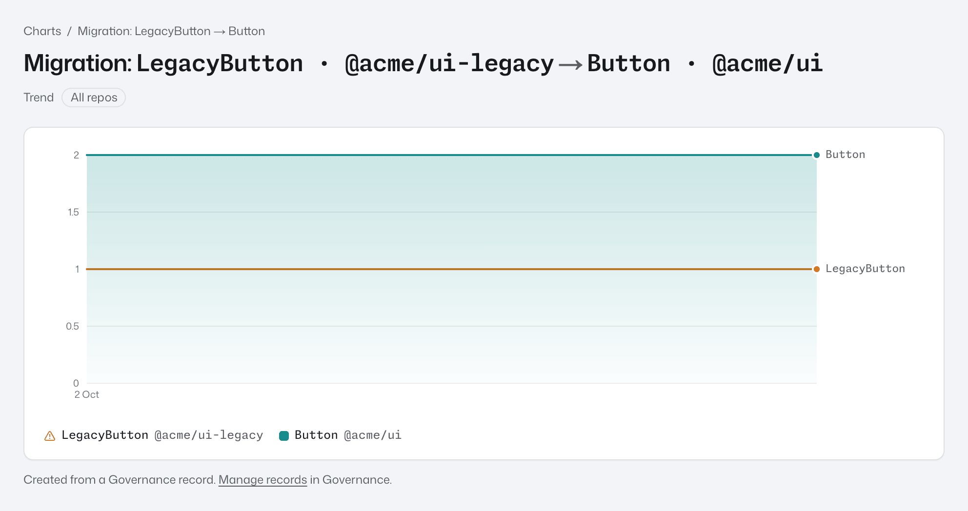
Back on the charts list, the row now reads ±0 since last scan. From here, each scan of a new commit adds a point. As the team replaces LegacyButton with Button, the LegacyButton line falls and the Button line rises. Run in CI scans and uploads from CI, so the chart keeps itself up to date.
What we've done
We uploaded a scan, found our repo, read its components down to single lines of code, grouped its packages into two libraries, and recorded a migration that the dashboard tracks in every repo and charts on every scan.
Where to go next:
- Migrations and retirements covers retirements, whole-package records and finishing a migration.
- Charts compares
acme-uiandacme-ui-legacyside by side across repos. - Reading the numbers explains what each count includes.