Charts
The charts area shows how usage changes across your repos over time. It holds the running status of every migration and retirement, and the charts you save to compare libraries, packages or components across scans.
For example, with the tags acme-ui and acme-ui-legacy in place, one saved chart shows the new library's usage rising while the old one falls, scan by scan, across every repo.
Read the charts list
Select charts in the top navigation. The page has three parts:
- Migrations: one row per migration, such as
LegacyButton · @acme/ui-legacytoButton · @acme/ui, reading N% migrated with the change since the last scan. - Retirements: one row per retirement, reading N remaining, the occurrences still in use.
- Saved charts: one row per chart someone has saved, with its name, chart type, scope and a small preview. A row marked Some components can't be found needs fixing.
The change is green when the work moved forward and red when it moved back. Active rows come first, the most remaining at the top. Finished ones sit behind Show N complete.
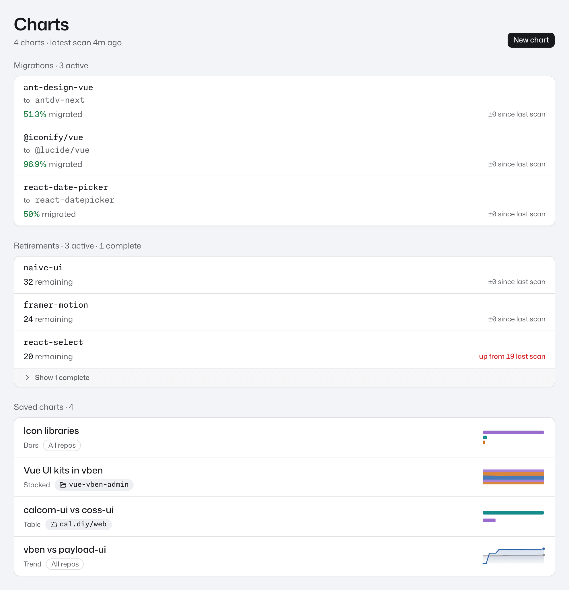
Select any row to open its chart.
Chart types
| Chart type | What it shows |
|---|---|
| Trend | One line per series over time. |
| Bars | One bar per series, counted from each repo's latest scan. |
| Stacked | Each series' share of the chart, as one bar for the latest scans and as bands over time. |
| Table | One row per series, with its latest value, the change since the previous scan and how many components it holds. |
A series is one line, bar or row on the chart. Over time, a chart gains a point for each new commit scanned in a repo in its scope.
Build a chart
To compare libraries you need a tag for each. Tags shows how to create acme-ui and acme-ui-legacy, the two used here. Package and component series need no tag.
- On the charts page, press New chart.
- Type a name into Name, for example
acme-ui vs acme-ui-legacy. - Under Repos, keep All repos, or pick one repo such as
storefront. - Under Chart type, pick Trend.
- Under Metric, keep Count to chart occurrences, or pick Share for each series' share of the chart's total. Stacked always shows share, so the control disappears when you pick it.
- In the Series panel, on the Tags tab, press
acme-ui, thenacme-ui-legacy. Each gets a✓and appears in the list at the top of the panel with its colour. The preview on the right redraws as you go. - Press Save chart. The chart opens on its own page and appears under Saved charts.
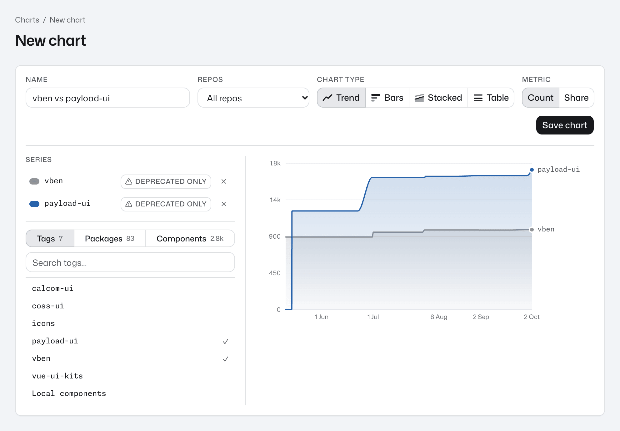
If the preview reads Trends appear once these repos have been scanned more than once., the repos in scope have only been scanned once. Save the chart anyway: it fills in as new scans arrive.
Add other kinds of series
The picker's other entries chart more than tags:
- Local components, at the end of the Tags tab, counts every component defined in the repo rather than imported from a package.
- The Packages tab adds one package, such as
@acme/icons. - The Components tab adds one component, such as
Buttonfrom@acme/ui.
With one repo picked under Repos, the Packages and Components tabs list only what that repo's latest scan contains. A tab shows at most 50 entries, so type into the search box to find the rest. To remove a series, press its × in the list, or press its entry in the picker again.
Count only deprecated components
To see how much deprecated code a library still has, press deprecated only on a tag or package series in the list at the top of the Series panel. The series then counts only the components a lifecycle record marks as superseded or retired. If no record covers any of them, the series drops to zero.
Change or delete a chart
On a chart's page, except for a Stacked chart, the Count and Share toggle switches the view without changing the saved chart.
To change the chart itself, press Edit. The chart builder opens with the chart's name, repos, chart type, metric and series. Make your changes and press Save chart to update the same chart.
To delete a chart, open it, press Delete, then Delete chart. Deleting can't be undone, and any signed-in user can delete any saved chart.
Fix a chart with missing components
A chart leaves off any series the dashboard can no longer find, and its row on the charts list reads Some components can't be found. That happens when a tag has been deleted, or when none of the chart's scans holds a component.
- Open the chart and press Edit.
- In the list at the top of the Series panel, find the greyed-out series. It reads Unknown component, or Deleted tag for a tag, when the dashboard has no name left for it.
- Press its × to remove it. To keep charting that component, add it again from the Components tab. A chart needs at least one series before you can save it.
- Press Save chart.
Migration and retirement charts
You don't build these. Each comes from a lifecycle record on the governance page, and shows occurrences over time across every repo: the deprecated side and its successor for a migration, the retired side alone for a retirement. A record only gets a row once a scan has used what it names.
These charts have no Edit or Delete. One goes away when its record is deleted. See Migrations and retirements.
Good to know
- With Share or Stacked, a caption in the chart builder warns that series can share components. It shows for two tags too, not only for overlapping series. A component in two series counts in both, for example with a tag and a package under that tag on one chart. See Why shares can overlap.
- The Migrations and Retirements rows and the saved-chart previews on the charts list catch up a moment after a scan is uploaded or a record, tag or chart is saved. A chart you've just saved shows a flat preview until then.
- A chart over time leaves out scans that aren't ready and lists them above the chart, for example 1 scan is left out. A chart of the latest scans uses each repo's newest ready scan and says which repos it shows at an older scan.
- If the new chart builder or a chart's page shows Preparing scan data instead of its content, the dashboard is still getting scan data ready, and the chart loads by itself when it's done. Scan data can't be read means the dashboard can't read a stored scan the chart needs. See When a page shows Preparing scan data.
Next step
Record a migration so its progress charts itself: see Migrations and retirements.